Overview
Designing a scalable,
online buying experience.
Designing a scalable,
online buying experience.
Designing a scalable,
online buying experience.
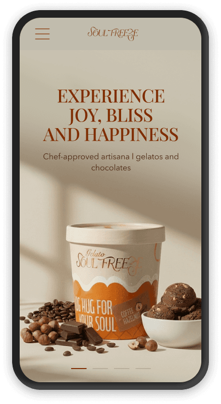
Soul Freeze is a handcrafted gelato brand from Delhi, 100% vegetarian, sourced from premium ingredient markets worldwide.
Soul Freeze is a handcrafted gelato brand from Delhi, 100% vegetarian, sourced from premium ingredient markets worldwide.
As part of their growth strategy, the brand is expanding into B2C by building a comprehensive online presence focused on brand awareness, product discovery, and direct sales.
As part of their growth strategy, the brand is expanding into B2C by building a comprehensive online presence focused on brand awareness, product discovery, and direct sales.
Role
Product Designer
Timeline
5 Weeks (Nov - Dec 2025)
5 Weeks
Team
Co-founder · Developer
DEvices
Desktop · Mobile · Tablet
The Starting Point
Loved offline. Missing online.
Loved offline. Missing online.
Loved offline. Missing online.
Customers had no way to place an order digitally.
Approvals on quick commerce platforms like Blinkit and Zepto were still pending.
Customers had no way to place an order digitally.
Approvals on quick commerce platforms like Blinkit and Zepto were still pending.
01
Manual ordering
Bulk and individual orders were handled over calls and emails.
This process was error-prone, untracked, and unscalable.
Bulk and individual orders were handled over calls and emails.
This process was error-prone, untracked, and unscalable.
02
Hidden product range
Combo packs and offers went undiscovered, buried in PDFs that were easy to miss.
It was a bit of a hassle to order using the pdf.
Combo packs and offers went undiscovered, buried in PDFs that were easy to miss.
It was a bit of a hassle to order using the pdf.
03
No franchise channel
Interested partners had no formal entry point.
There's no dedicated place to learn about opportunities or get in touch.
Interested partners had no formal entry point.
There's no dedicated place to learn about opportunities or get in touch.
04
No design system
Packaging existed. Digital guidelines did not.
Typography, colour, and components were all built from the ground up.
Packaging existed. Digital guidelines did not.
Typography, colour, and components were all built from the ground up.
The Central Question
How might we design
How might we design
How might we design
an e-commerce experience that feels
an e-commerce experience that feels
an e-commerce experience that feels
unmistakeably premium,
unmistakeably premium,
unmistakeably premium,
while allowing effortless product discovery?
while allowing effortless product discovery?
while allowing effortless product discovery?
Goals
Primary
Give customers a way to discover and buy Soul Freeze products online for the first time
Reduce reliance on manual ordering for individuals and bulk buyers
Create a structured franchise inquiry channel
Secondary
Establish a visual identity that extends the brand without breaking it, more refined than the packaging, not at odds with it
Design for both first-time browsers and repeat buyers
Build a component system that scales as the product range grows
The Strategy
A deliberate two-phase rollout.
A deliberate two-phase rollout.
A deliberate two-phase rollout.
The client wanted presence before commerce.
Phase 1 would establish the brand digitally and Phase 2 would make it shoppable.
The client wanted presence before commerce. Phase 1 would establish the brand digitally and Phase 2 would make it shoppable.
01
01
Launch 1 · Brand Presence
Show before sell.
Show before sell.
Homepage — browsable, not shoppable ( no price, no cart & checkout)
Franchise page
Build awareness and begin franchise conversations before the full buying experience was ready.
02
02
Launch 2 · Full Commerce
Fully shoppable.
Fully shoppable.
All category + product pages
Cart · Gifting · About
Homepage becomes a conversion-first experience without losing the premium feel.
few Questions to think about
01
What does a “premium” experience actually mean here?
What does a “premium” experience actually mean here?
What does a “premium” experience actually mean here?
02
What information does a potential franchise partner actually need?
What information does a potential franchise partner actually need?
What information does a potential franchise partner actually need?
03
How do we avoid overwhelming users when there's an option to select 12 flavours?
How do we avoid overwhelming users when there's an option to select 12 flavours?
How do we avoid overwhelming users when there's an option to select 12 flavours?
04
How should search and filtering behave?
How should search and filtering behave?
How should search and filtering behave?
an interesting Ux challenge
Designing a flexible 12 flavour combo pack builder that works across devices.
Designing a flexible 12 flavour combo pack builder that works across devices.
Designing a flexible 12 flavour combo pack builder that works across devices.
The client wanted customers to be able to build their own 12-flavour combo pack, selecting flavours as they liked.
I explored different interaction patterns to make flavour selection clear, quick, and responsive across devices.
The real challenge wasn't selection. It was that people want to repeat flavours. That only became visible when looking at the interaction.
The client wanted customers to be able to build their own 12-flavour combo pack, selecting flavours as they liked. I explored different interaction patterns to make flavour selection clear, quick, and responsive across devices.
The real challenge wasn't selection. It was that people want to repeat flavours. That only became visible when looking at the interaction.


the pivot
When premium and conversion pulled in different directions.
When premium and conversion pulled in different directions.
When premium and conversion pulled in different directions.
The chocolate page had 8 products. All handcrafted. All premium.
For silky, handcrafted Belgian couverture chocolates at a premium price point, a loud “Add to Cart” was doing the brand a disservice.
The experience needed to feel just as considered as the product.
The chocolate page had 8 products. All handcrafted. All premium.
For silky, handcrafted Belgian couverture chocolates at a premium price point, a loud “Add to Cart” was doing the brand a disservice.
The experience needed to feel just as considered as the product.

01
01
version 1 · Conversion first
Buttons always visible
Buttons always visible
Standard e-commerce pattern. Buttons always visible.
Works well for large catalogues.
Felt too transactional for a small, premium collection.
Standard e-commerce pattern. Buttons always visible.
Works well for large catalogues.
Felt too transactional for a small, premium collection.
02
02
Version 2 · Premium First
Buttons on hover
Buttons on hover
Desktop: Button appears only on hover → Grid stays clean and editorial, letting the product photography breathe.
Mobile: Button stays visible since hover doesn't exist on touch.
Desktop: Button appears only on hover → Grid stays clean and editorial, letting the product photography breathe.
Mobile: Button stays visible since hover doesn't exist on touch.

What shaped the decisions
The constraints.
The constraints.
The constraints.
5 weeks
5 weeks
Tight timeline and evolving scope
Tight timeline with scope, requirements and priorities shifting as the business itself was still figuring out what it wanted to be.
Tight timeline with scope, requirements and priorities shifting as the business itself was still figuring out what it wanted to be.
Wix
Wix
Platform limitations (Wix)
Wix shaped more decisions than anticipated.
Some design intent didn't survive the build process exactly as designed.
Wix shaped more decisions than anticipated.
Some design intent didn't survive the build process exactly as designed.
Trends
Trends
Balancing visual preferences with usability
Trend driven interactions looked great in theory.
But for an e-com site, page speed and usability had to come first.
Trend driven interactions looked great in theory.
But for an e-com site, page speed and usability had to come first.
Reflections
What I learnt from this project.
What I learnt from this project.
What I learnt from this project.
The early stage brands are still figuring out what they want.
Which is completely normal. It's just that i never thought about this stuff before.
The brief kept evolving through out the project.
Ecommerce, then just a brand site, then ecommerce again.
Five weeks to establish an entire design system was already ambitious. And with priorities shifting it was absolutely chaotic.
The early stage brands are still figuring out what they want.
Which is completely normal. It's just that i never thought about this stuff before.
The brief kept evolving through out the project.
Ecommerce, then just a brand site, then ecommerce again.
Five weeks to establish an entire design system was already ambitious. And with priorities shifting it was absolutely chaotic.
