
When your website doesnt match your reputation
When your website doesnt match your reputation
When your website doesnt match your reputation
The challenge
The DisconnectThe Disconnect
GyanOne has built its reputation on results. They're known in MBA consulting circles for getting clients into top business schools. They show outcomes that speak for themselves.
But their website told a different story. Or rather, it didn't tell much of a story at all.
It felt content-heavy and hard to navigate, making it challenging for visitors to quickly understand the services or take action.
The challenge
The DisconnectThe Disconnect
GyanOne has built its reputation on results. They're known in MBA consulting circles for getting clients into top business schools. They show outcomes that speak for themselves.
But their website told a different story. Or rather, it didn't tell much of a story at all.
It felt content-heavy and hard to navigate, making it challenging for visitors to quickly understand the services or take action.
The challenge
The DisconnectThe Disconnect
GyanOne has built its reputation on results. They're known in MBA consulting circles for getting clients into top business schools. They show outcomes that speak for themselves.
But their website told a different story. Or rather, it didn't tell much of a story at all.
It felt content-heavy and hard to navigate, making it challenging for visitors to quickly understand the services or take action.
The Brief
The Brief
To redesign the desktop experience for four key pages to reflect the premium, professional positioning GyanOne has earned in the market.
Target Audience
Target Audience
Ambitious MBA applicants (primarily Gen Z) researching consultancies, comparing services, and evaluating credibility before committing.
My Contribution
My Contribution
Full UI/UX redesign of Homepage, MBA, About Us, and Success Stories pages, from audit to final handoff.
Discovery
Understanding what was breakingUnderstanding what was breaking
The site had clear issues even on first look.
But before jumping into solutions, I wanted to make sure I had the full picture and not just what stood out to me, but what real users were experiencing too.
Heuristic Evaluation
I conducted an audit of the site against Nielsen's heuristics, focusing on areas that matter most like visibility of system status, consistency, error prevention, and recognition over recall. I used ChatGPT to help structure the evaluation framework and identify patterns across pages that I might have missed in manual review.
Think-Aloud User Sessions
I recruited five people who matched GyanOne's target demographic. I asked each of them to complete basic tasks, such as understanding what GyanOne offers, while thinking aloud. These sessions surfaced valuable insights into how people actually experienced the website revealing moments of confusion, emotional reactions, and places where trust began to break.
Discovery
Understanding what was breakingUnderstanding what was breaking
The site had clear issues even on first look.
But before jumping into solutions, I wanted to make sure I had the full picture and not just what stood out to me, but what real users were experiencing too.
Heuristic Evaluation
I conducted an audit of the site against Nielsen's heuristics, focusing on areas that matter most like visibility of system status, consistency, error prevention, and recognition over recall. I used ChatGPT to help structure the evaluation framework and identify patterns across pages that I might have missed in manual review.
Think-Aloud User Sessions
I recruited five people who matched GyanOne's target demographic. I asked each of them to complete basic tasks, such as understanding what GyanOne offers, while thinking aloud. These sessions surfaced valuable insights into how people actually experienced the website revealing moments of confusion, emotional reactions, and places where trust began to break.
Discovery
Understanding what was breakingUnderstanding what was breaking
The site had clear issues even on first look.
But before jumping into solutions, I wanted to make sure I had the full picture and not just what stood out to me, but what real users were experiencing too.
Heuristic Evaluation
I conducted an audit of the site against Nielsen's heuristics, focusing on areas that matter most like visibility of system status, consistency, error prevention, and recognition over recall. I used ChatGPT to help structure the evaluation framework and identify patterns across pages that I might have missed in manual review.
Think-Aloud User Sessions
I recruited five people who matched GyanOne's target demographic. I asked each of them to complete basic tasks, such as understanding what GyanOne offers, while thinking aloud. These sessions surfaced valuable insights into how people actually experienced the website revealing moments of confusion, emotional reactions, and places where trust began to break.
Three patterns emerged consistently across both methods:Three patterns emerged consistently across both methods:
Lack of visual hierarchy increased friction
The pages were visually flat.
During think-aloud sessions, I observed users scanning the page in erratic patterns where their eyes darted around looking for an entry point, but found none.
Although this sounds like just an aesthetic issue, it was a business problem.
Visitors couldn't quickly figure out what GyanOne offered, why they should care, or what to do next.
In a high-consideration purchase category like MBA consulting, this friction is fatal.


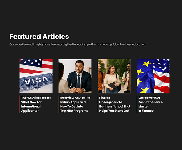
SOLUTION
Built a Visual Hierarchy Based on Natural Reading Patterns
I restructured the layout around natural scanning patterns, making it easier to move from understanding the offering to taking action.
Left-aligning content instead of centre aligning it.
Creating deliberate contrast through type scale and spacing.
Establishing a clear visual hierarchy to guide attention from primary messaging → supporting details → conversion points.
Poor content structure increased cognitive load
GyanOne's strongest proof points were hidden within dense, text-heavy pages.
User testing showed that visitors scanned for information but struggled to identify what mattered, as inconsistent formatting and weak hierarchy created unnecessary cognitive load.
Visitors weren't reading. They were scanning, getting overwhelmed, and leaving.

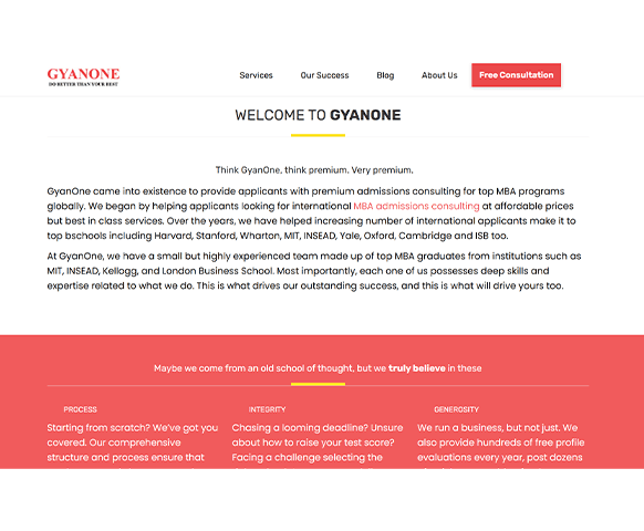


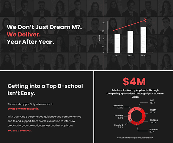

Solution
Restructured Content for Scanning
I worked closely with the content writer to reorganise the copy and prioritise the strongest proof points.
Transformed dense blocks of content into modular, scannable sections with stronger visual hierarchy.
Key statistics became visual callouts,
Testimonials were given dedicated treatment, and
Lists replaced long-form text where appropriate.
The Result: Visitors can understand GyanOne's value in seconds while still having access to the depth needed for deeper evaluation.
Visual inconsistency undermined trust
Clashing colours, mismatched icon styles, and inconsistent typography made the website feel fragmented.
During user testing, participants questioned the professionalism of the business because the experience didn't reflect GyanOne's established credibility.

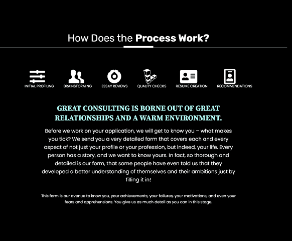


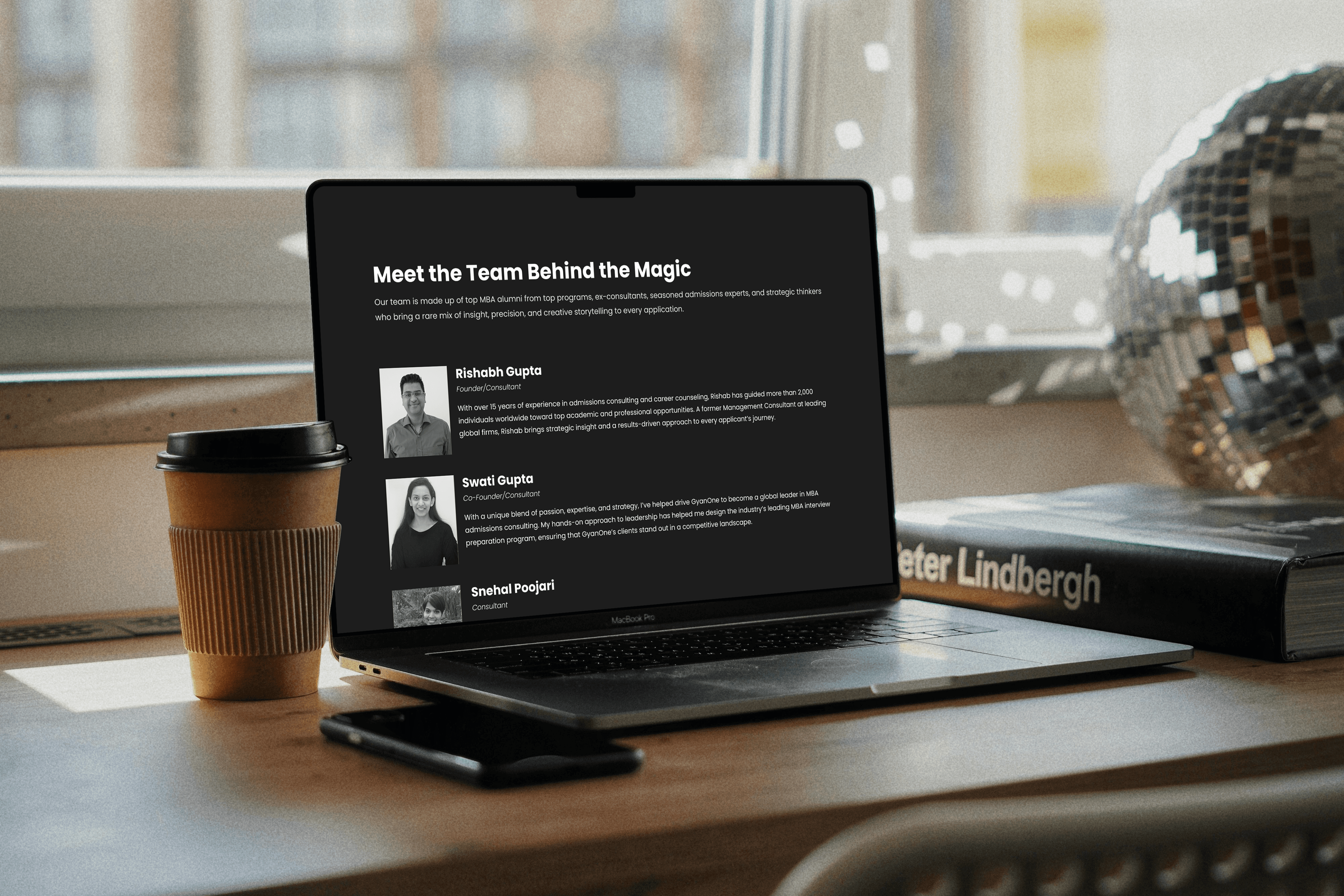


Solution
Built a Cohesive Design System That Signals Professionalism
To improve consistency, I established a shared design system for colours, typography, iconography, and spacing.
Every page now feels like part of the same brand, reinforcing trust and professionalism throughout the experience.
Three patterns emerged consistently across both methods:Three patterns emerged consistently across both methods:
Lack of visual hierarchy increased friction
The pages were visually flat.
During think-aloud sessions, I observed users scanning the page in erratic patterns where their eyes darted around looking for an entry point, but found none.
Although this sounds like just an aesthetic issue, it was a business problem.
Visitors couldn't quickly figure out what GyanOne offered, why they should care, or what to do next.
In a high-consideration purchase category like MBA consulting, this friction is fatal.
SOLUTION
Built a Visual Hierarchy Based on Natural Reading Patterns
I restructured the layout around natural scanning patterns, making it easier to move from understanding the offering to taking action.
Left-aligning content instead of centre aligning it.
Creating deliberate contrast through type scale and spacing.
Establishing a clear visual hierarchy to guide attention from primary messaging → supporting details → conversion points.
Poor content structure increased cognitive load
GyanOne's strongest proof points were hidden within dense, text-heavy pages.
User testing showed that visitors scanned for information but struggled to identify what mattered, as inconsistent formatting and weak hierarchy created unnecessary cognitive load.
Visitors weren't reading. They were scanning, getting overwhelmed, and leaving.
Solution
Restructured Content for Scanning
I worked closely with the content writer to reorganise the copy and prioritise the strongest proof points.
Transformed dense blocks of content into modular, scannable sections with stronger visual hierarchy.
Key statistics became visual callouts,
Testimonials were given dedicated treatment, and
Lists replaced long-form text where appropriate.
The Result: Visitors can understand GyanOne's value in seconds while still having access to the depth needed for deeper evaluation.
Visual inconsistency undermined trust
Clashing colours, mismatched icon styles, and inconsistent typography made the website feel fragmented.
During user testing, participants questioned the professionalism of the business because the experience didn't reflect GyanOne's established credibility.
Solution
Built a Cohesive Design System That Signals Professionalism
To improve consistency, I established a shared design system for colours, typography, iconography, and spacing.
Every page now feels like part of the same brand, reinforcing trust and professionalism throughout the experience.
Three patterns emerged consistently across both methods:Three patterns emerged consistently across both methods:
Lack of visual hierarchy increased friction
The pages were visually flat.
During think-aloud sessions, I observed users scanning the page in erratic patterns where their eyes darted around looking for an entry point, but found none.
Although this sounds like just an aesthetic issue, it was a business problem.
Visitors couldn't quickly figure out what GyanOne offered, why they should care, or what to do next.
In a high-consideration purchase category like MBA consulting, this friction is fatal.
SOLUTION
Built a Visual Hierarchy Based on Natural Reading Patterns
I restructured the layout around natural scanning patterns, making it easier to move from understanding the offering to taking action.
Left-aligning content instead of centre aligning it.
Creating deliberate contrast through type scale and spacing.
Establishing a clear visual hierarchy to guide attention from primary messaging → supporting details → conversion points.
Poor content structure increased cognitive load
GyanOne's strongest proof points were hidden within dense, text-heavy pages.
User testing showed that visitors scanned for information but struggled to identify what mattered, as inconsistent formatting and weak hierarchy created unnecessary cognitive load.
Visitors weren't reading. They were scanning, getting overwhelmed, and leaving.
Solution
Restructured Content for Scanning
I worked closely with the content writer to reorganise the copy and prioritise the strongest proof points.
Transformed dense blocks of content into modular, scannable sections with stronger visual hierarchy.
Key statistics became visual callouts,
Testimonials were given dedicated treatment, and
Lists replaced long-form text where appropriate.
The Result: Visitors can understand GyanOne's value in seconds while still having access to the depth needed for deeper evaluation.
Visual inconsistency undermined trust
Clashing colours, mismatched icon styles, and inconsistent typography made the website feel fragmented.
During user testing, participants questioned the professionalism of the business because the experience didn't reflect GyanOne's established credibility.
Solution
Built a Cohesive Design System That Signals Professionalism
To improve consistency, I established a shared design system for colours, typography, iconography, and spacing.
Every page now feels like part of the same brand, reinforcing trust and professionalism throughout the experience.
WRAP-UP
Challenges and constraintsChallenges and constraints
One of the biggest challenges in this project was aligning on what "Premium and Professional" meant to the client.
These words were central to her vision, but they were abstract and subjective. I invested time in exploring visual directions, sharing iterations, and having clarifying discussions until we built a shared understanding. Once that alignment was achieved, the design process moved forward much more smoothly.
Another challenge was the content flow.
The client had a lot of information to showcase, but not all of it was structured in a way that guided users logically. I worked closely with the content writer to reorganise the material across pages, ensuring that the narrative made sense for both users and the business.
In terms of constraints, the project was scoped specifically for desktop due to timeline and resource limitations. I made sure the layouts and components were scalable and developer-friendly so they could be extended to mobile in future phases.
Additionally, since the development resources were limited, I kept the UI deliberately simple and implementation-friendly, avoiding overly complex interactions or visuals. This ensured that the developer could translate the designs accurately without losing fidelity.
WRAP-UP
Challenges and constraintsChallenges and constraints
One of the biggest challenges in this project was aligning on what "Premium and Professional" meant to the client.
These words were central to her vision, but they were abstract and subjective. I invested time in exploring visual directions, sharing iterations, and having clarifying discussions until we built a shared understanding. Once that alignment was achieved, the design process moved forward much more smoothly.
Another challenge was the content flow.
The client had a lot of information to showcase, but not all of it was structured in a way that guided users logically. I worked closely with the content writer to reorganise the material across pages, ensuring that the narrative made sense for both users and the business.
In terms of constraints, the project was scoped specifically for desktop due to timeline and resource limitations. I made sure the layouts and components were scalable and developer-friendly so they could be extended to mobile in future phases.
Additionally, since the development resources were limited, I kept the UI deliberately simple and implementation-friendly, avoiding overly complex interactions or visuals. This ensured that the developer could translate the designs accurately without losing fidelity.
WRAP-UP
Challenges and constraintsChallenges and constraints
One of the biggest challenges in this project was aligning on what "Premium and Professional" meant to the client.
These words were central to her vision, but they were abstract and subjective. I invested time in exploring visual directions, sharing iterations, and having clarifying discussions until we built a shared understanding. Once that alignment was achieved, the design process moved forward much more smoothly.
Another challenge was the content flow.
The client had a lot of information to showcase, but not all of it was structured in a way that guided users logically. I worked closely with the content writer to reorganise the material across pages, ensuring that the narrative made sense for both users and the business.
In terms of constraints, the project was scoped specifically for desktop due to timeline and resource limitations. I made sure the layouts and components were scalable and developer-friendly so they could be extended to mobile in future phases.
Additionally, since the development resources were limited, I kept the UI deliberately simple and implementation-friendly, avoiding overly complex interactions or visuals. This ensured that the developer could translate the designs accurately without losing fidelity.
